Grid Sections
Flexible grid sections for showcasing features, integrations, and resources in modern developer portals.
Grid sections are a flexible way to organize and present different types of content in a developer portal. These layouts are ideal for showcasing product features, integrations, documentation links, or resources in a clear, scannable format. Use them to structure complex information into visually consistent blocks that scale across screen sizes and content types.

Here you have a place in the subheading for your developer portal so users can know more about your amazing product
Self-Serve Documentation
Access up-to-date, searchable guides.
::page-container
---
display: "grid"
grid-columns: 1
grid-columns-breakpoints:
mobile: 1
phablet: 1
tablet: 2
laptop: 2
desktop: 2
gap: "32px"
---
:::grid-item
---
grid-column: "1 / span 2"
grid-column-breakpoints:
mobile: "1 / span 2"
phablet: "1 / span 2"
tablet: "1 / 2"
laptop: "1 / 2"
desktop: "1 / 2"
---
::::card
---
title-font-size: "clamp(58px, 3.4vw, 78px)"
title-line-height: "100%"
styles: |
height: 100%;
.portal-card-footer {
font-size: clamp(16px, 3.4vw, 22px);
line-height: clamp(20px, 3.4vw, 26px);
}
---
#title
100k+
#footer
Spend time building, not maintaining infrastructure.
::::
:::
:::grid-item
---
grid-column: "1 / span 2"
grid-column-breakpoints:
mobile: "1 / span 2"
phablet: "1 / span 2"
tablet: "2 / 3"
laptop: "2 / 3"
desktop: "2 / 3"
---
::::card
---
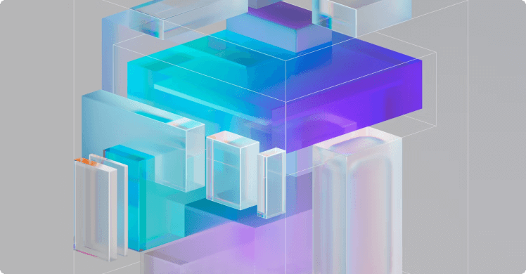
image: "./images/examples/sections/hero-large-image.png"
image-position: "bottom"
styles: |
height: 100%;
.portal-card-description {
font-size: clamp(16px, 3.4vw, 22px);
line-height: clamp(20px, 3.4vw, 26px);
}
.portal-card-image {
max-height: 193px;
object-fit: cover !important;
}
---
#default
Here you have a place in the subheading for your developer portal so users can know more about your amazing product
::::
:::
:::grid-item
---
grid-column: "1 / 3"
---
::::container
---
display: "grid"
grid-columns: 1
grid-columns-breakpoints:
mobile: 1
phablet: 1
tablet: 2
laptop: 3
desktop: 3
gap: "0"
border: "1px solid #E0E4EA"
border-radius: "8px"
---
:::grid-item
---
grid-column: "1 / span 3"
grid-column-breakpoints:
mobile: "1 / span 3"
phablet: "1 / span 3"
tablet: "1 / 2"
laptop: "1 / 2"
desktop: "1 / 2"
padding: "clamp(20px, 3.4vw, 32px)"
styles: |
font-size: clamp(18px, 3.4vw, 24px);
line-height: 100%;
display: flex;
flex-direction: column;
justify-content: center;
strong {
font-size: clamp(24px, 3.4vw, 32px);
line-height: 100%;
}
---
**Self-Serve Documentation**
Access up-to-date, searchable guides.
:::
:::grid-item
---
grid-column: "1 / span 3"
grid-column-breakpoints:
mobile: "1 / span 3"
phablet: "1 / span 3"
tablet: "2 / span 2"
laptop: "2 / span 2"
desktop: "2 / span 2"
---
::::image
---
src: "./images/examples/sections/grid-large-image.png"
object-fit: "cover"
styles: |
width: 100%;
height: 100%;
border-radius: 0 8px 8px 0;
---
::::
:::
::::
:::
::

Spend time building, not maintaining infrastructure.

Best-in-class security practices to keep your integration safe.

Access up-to-date, searchable guides without context switching.

Built to handle any traffic on your collaborative experiences.

Scale to millions of users. No complex configuration required.
::page-container
---
display: "grid"
grid-columns: 1
grid-columns-breakpoints:
  mobile: 1
  phablet: 1
  tablet: 6
  laptop: 6
  desktop: 6
gap: "32px"
styles: |
  .portal-card{
    height: 100%;
  }

  .portal-card-description {
    font-size: clamp(18px, 3.4vw, 20px);
    line-height: 100%;
  }
---
  :::grid-item
  ---
  grid-column: "1 / span 6"
  grid-column-breakpoints:
    mobile: "1 / span 6"
    phablet: "1 / span 6"
    tablet: "1 / span 2"
    laptop: "1 / span 2"
    desktop: "1 / span 2"
  ---
    ::::card
    ---
    title-font-size: "clamp(20px, 3.4vw, 28px)"
    title-line-height: "clamp(24px, 3.4vw, 32px)"
    ---
    #tagline
      ::image
      ---
      src: "./images/examples/sections/info.png"
      ---
      ::

    #title
    Kong API Dev Portal

    #default
    Spend time building, not maintaining infrastructure.
    ::::
  :::

  :::grid-item
  ---
  grid-column: "1 / span 6"
  grid-column-breakpoints:
    mobile: "1 / span 6"
    phablet: "1 / span 6"
    tablet: "3 / span 2"
    laptop: "3 / span 2"
    desktop: "3 / span 2"
  ---
    ::::card
    ---
    title-font-size: "clamp(20px, 3.4vw, 28px)"
    title-line-height: "clamp(24px, 3.4vw, 32px)"
    ---
    #tagline
      ::image
      ---
      src: "./images/examples/sections/widgets.png"
      ---
      ::

    #title
    Enterprise‑ready security

    #default
    Best-in-class security practices to keep your integration safe.
    ::::
  :::

  :::grid-item
  ---
  grid-column: "1 / span 6"
  grid-column-breakpoints:
    mobile: "1 / span 6"
    phablet: "1 / span 6"
    tablet: "5 / span 2"
    laptop: "5 / span 2"
    desktop: "5 / span 2"
  ---
    ::::card
    ---
    title-font-size: "clamp(20px, 3.4vw, 28px)"
    title-line-height: "clamp(24px, 3.4vw, 32px)"
    ---
    #tagline
      ::image
      ---
      src: "./images/examples/sections/vitals.png"
      ---
      ::

    #title
    Self-Serve Documentation

    #default
    Access up-to-date, searchable guides without context switching.
    ::::
  :::

  :::grid-item
  ---
  grid-column: "1 / span 6"
  grid-column-breakpoints:
    mobile: "1 / span 6"
    phablet: "1 / span 6"
    tablet: "1 / span 3"
    laptop: "1 / span 3"
    desktop: "1 / span 3"
  ---
    ::::card
    ---
    title-font-size: "clamp(20px, 3.4vw, 28px)"
    title-line-height: "clamp(24px, 3.4vw, 32px)"
    background-color: "#F9FAFB"
    ---
    #tagline
      ::image
      ---
      src: "./images/examples/sections/insights.png"
      ---
      ::

    #title
    Effortless scaling

    #default
    Built to handle any traffic on your collaborative experiences.
    ::::
  :::

  :::grid-item
  ---
  grid-column: "1 / span 6"
  grid-column-breakpoints:
    mobile: "1 / span 6"
    phablet: "1 / span 6"
    tablet: "4 / span 3"
    laptop: "4 / span 3"
    desktop: "4 / span 3"
  ---
    ::::card
    ---
    title-font-size: "clamp(20px, 3.4vw, 28px)"
    title-line-height: "clamp(24px, 3.4vw, 32px)"
    background-color: "#F9FAFB"
    ---
    #tagline
      ::image
      ---
      src: "./images/examples/sections/document.png"
      ---
      ::

    #title
    Minimal configuration

    #default
    Scale to millions of users. No complex configuration required.
    ::::
  :::
::
A platform you can trust at scale.
Here you have a place in the subheading for your developer portal so users can know more about your amazing product
Spend time building, not maintaining infrastructure.
Best-in-class security practices to keep your integration safe.
Built to handle any traffic on your collaborative experiences.
Scale to millions of users. No complex configuration required.
::page-container
---
display: "grid"
grid-columns: 1
grid-columns-breakpoints:
  mobile: 1
  phablet: 1
  tablet: 2
  laptop: 2
  desktop: 2
gap: "32px"
styles: |
  .portal-card {
    height: 100%;
  }

  .portal-card-description {
    font-size: clamp(18px, 3.4vw, 20px);
    line-height: 100%;
  }
---
  :::grid-item
  ---
  padding: "clamp(20px, 3.4vw, 32px)"
  grid-column: "1 / span 2"
  grid-column-breakpoints:
    mobile: "1 / span 2"
    phablet: "1 / span 2"
    tablet: "1 / span 2"
    laptop: "1 / span 2"
    desktop: "1 / span 2"
  styles: |
    border: 1px solid #E0E4EA;
    border-radius: 8px;
  ---
    ::::multi-column
    ---
    columns-breakpoints:
      mobile: 1
      phablet: 1
      tablet: 1
      laptop: 2
      desktop: 2
    ---
      ::::container
      ---
      font-size: "clamp(30px, 3.4vw, 46px)"
      line-height: "100%"
      font-weight: "700"
      ---
      A platform you can trust at scale.
      ::::

      ::::container
      ---
      font-size: "clamp(16px, 3.4vw, 24px)"
      line-height: "clamp(20px, 3.4vw, 28px)"
      ---
      Here you have a place in the subheading for your developer portal so users can know more about your amazing product
      ::::
    ::::
  :::

  :::grid-item
  ---
  grid-column: "1 / span 1"
  grid-column-breakpoints:
    mobile: "1 / span 1"
    phablet: "1 / span 1"
    tablet: "1 / span 1"
    laptop: "1 / span 1"
    desktop: "1 / span 1"
  ---
    ::::card
    ---
    title-font-size: "clamp(20px, 3.4vw, 28px)"
    title-line-height: "clamp(24px, 3.4vw, 32px)"
    ---
    #tagline
      ::image
      ---
      src: "./images/examples/sections/info.png"
      ---
      ::

    #title
    Kong API Dev Portal

    #default
    Spend time building, not maintaining infrastructure.
    ::::
  :::

  :::grid-item
  ---
  grid-column: "1 / span 1"
  grid-column-breakpoints:
    mobile: "1 / span 1"
    phablet: "1 / span 1"
    tablet: "2 / span 1"
    laptop: "2 / span 1"
    desktop: "2 / span 1"
  ---
    ::::card
    ---
    title-font-size: "clamp(20px, 3.4vw, 28px)"
    title-line-height: "clamp(24px, 3.4vw, 32px)"
    ---
    #tagline
      ::image
      ---
      src: "./images/examples/sections/widgets.png"
      ---
      ::

    #title
    Enterprise‑ready security

    #default
    Best-in-class security practices to keep your integration safe.
    ::::
  :::

  :::grid-item
  ---
  grid-column: "1 / span 1"
  grid-column-breakpoints:
    mobile: "1 / span 1"
    phablet: "1 / span 1"
    tablet: "1 / span 1"
    laptop: "1 / span 1"
    desktop: "1 / span 1"
  ---
    ::::card
    ---
    title-font-size: "clamp(20px, 3.4vw, 28px)"
    title-line-height: "clamp(24px, 3.4vw, 32px)"
    ---
    #tagline
      ::image
      ---
      src: "./images/examples/sections/insights.png"
      ---
      ::

    #title
    Effortless scaling

    #default
    Built to handle any traffic on your collaborative experiences.
    ::::
  :::

  :::grid-item
  ---
  grid-column: "1 / span 1"
  grid-column-breakpoints:
    mobile: "1 / span 1"
    phablet: "1 / span 1"
    tablet: "2 / span 1"
    laptop: "2 / span 1"
    desktop: "2 / span 1"
  ---
    ::::card
    ---
    title-font-size: "clamp(20px, 3.4vw, 28px)"
    title-line-height: "clamp(24px, 3.4vw, 32px)"
    ---
    #tagline
      ::image
      ---
      src: "./images/examples/sections/document.png"
      ---
      ::

    #title
    Minimal configuration

    #default
    Scale to millions of users. No complex configuration required.
    ::::
  :::
::