Components
Snippet
Use the Snippet component to reuse content across your Pages.
The Snippet component is used to reuse MDC content across Pages. This avoids updating each Page individually.
name provided when the Snippet is created.A typical use case for Snippets would be to include a section at the top of many Pages, explaining how a Developer would obtain API keys.
First, let's create a Snippet; we'll name it get-api-keys. From Portal Editor, the basic structure will be created. The title and description are not currently used in generating the content, and are not required, but can be useful to keep track of what you're working on alongside other Editors.
---
title: get-api-keys
description: How to get API keys
---
Any Markdown content, including MDC components and even other snippets, can be used in the Snippet content. In this case we'll use an Alert to inform the Developer how to obtain their API keys.
---
title: get-api-keys
description: How to get API keys
---

::alert
---
appearance: "info"
show-icon: true
title: "Obtain API keys"
---
To obtain API keys, refer to Authentication docs.
::
Once the Snippet is updated, we can refer to it in any Page. Within your Page, use the following syntax to refer to the get-api-keys Snippet:
::snippet
---
name: "get-api-keys"
---
::
When the Page is rendered, the referenced Snippet will be included. Now with this simple reference, you can use Snippets across as many pages as needed, and make content updates in one place.
In some cases, you might want a default message in your Snippet that can be overridden for particular Page references.
We can define default values simply by creating props in the Snippet front matter. In this example, we'll create apiMessage.
Within our alert component, we can refer to this value by prefixing the message prop with :, and set the value to snippet.apiMessage.
---
title: get-api-keys
description: How to get API keys
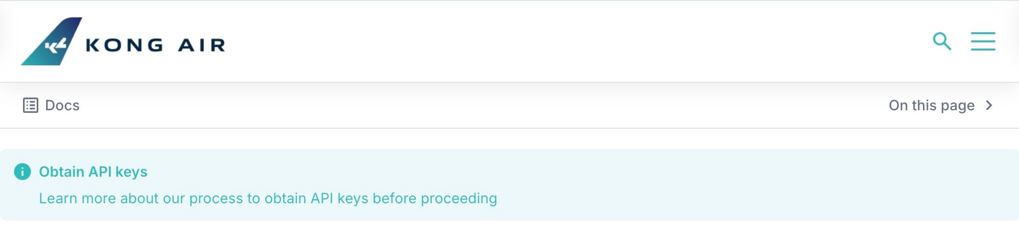
apiMessage: "Learn more about our process to obtain API keys before proceeding"
---
::alert
---
title: "Obtain API keys"
:message: snippet.apiMessage
appearance: "info"
show-icon: true
---
::
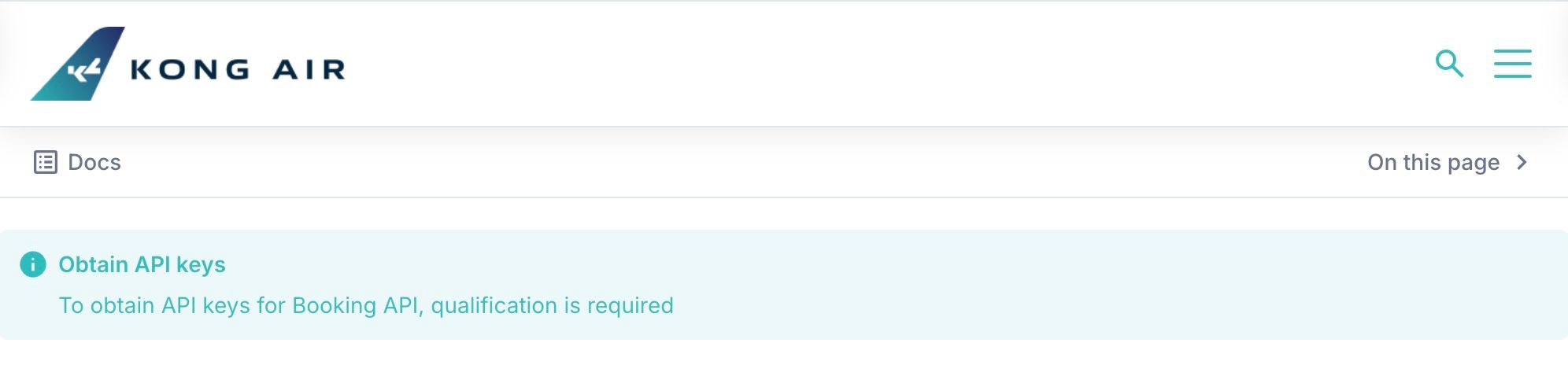
Now in the Page that refers to this Snippet, if we want to override the apiMessage for this particular Page, we can specify the same property in the data prop:
::snippet
---
name: "get-api-keys"
data:
  apiMessage: "To obtain API keys for Booking API, qualification is required"
---
::
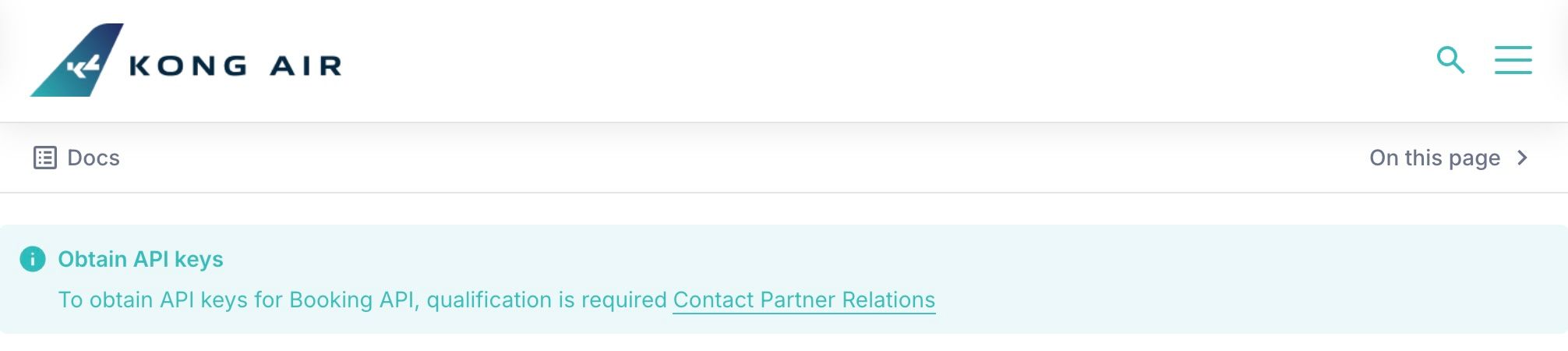
Taking this a step further, we might want to have a parameterized Link component in the Snippet, so each reference can pass a context-specific message and URL.
We can add linkUrl and linkMessage properties to the Snippet front matter to set our defaults. This also necessitates changing the syntax of the alert from using :message: to the body prop.
In the body of components, the syntax will need to change to "handlebar" style references. In this context, we'll need to use $doc.snippet.* prefixing our front matter props.
---
title: get-api-keys
description: How to get API keys

apiMessage: "Learn more about our process to obtain API keys before proceeding"
linkUrl: "/get-api-keys"
linkMessage: "Get API keys"
---

::alert
---
title: "Obtain API keys"
appearance: "info"
show-icon: true
---
{{ $doc.snippet.apiMessage }}
  ::a
  ---
  :href: snippet.linkUrl
  ---
  {{ $doc.snippet.linkMessage }}
  ::
::
Alternatively to setting defaults in front matter, when using "handlebar" or $doc.snippet prop references, defaults can be specified inline.
{{ $doc.snippet.linkMessage || 'Learn more about our process to obtain API keys before proceeding' }}
Now in the Page-level Snippet component usage, we can pass in the additional overrides in the data prop.
::snippet
---
name: "get-api-keys"
data:
  apiMessage: "To obtain API keys for Booking API, qualification is required"
  linkMessage: "Contact Partner Relations"
  linkUrl: "/partner-services"
---
::
Similar to Pages, Portal Snippet documents allow for defining the snippet's visibility property as either 'public' or 'private'.
A Portal Snippet with visibility: 'public' can be utilized without issue within any Page.
You can use private Portal Snippets within public or private Pages and Snippet documents; however, if requested with invalid or missing credentials (i.e. if the user is not authenticated), the Portal API will return a 404 response for the private snippet.
In this scenario, the Snippet component will silently log the error, prevent the display of any private content within the parent document, and the parent Page or Portal Snippet will continue to render.
This can be useful when you'd like to create sections of a Page which are only displayed to logged-in users.
The unique name of the snippet, matching the snippet name property returned from the Portal API.
stringtrue::snippet
---
name: "my-snippet"
---
::
Freeform data to provide to your snippet. It is recommended that all child properties of the data prop be provided as camelCase strings. You may define properties as kebab-case or camelCase; however, when using dynamic data, you must use the same format when referencing the variable.
Record<string, any>{}::snippet
---
name: "my-snippet"
data:
characterName: "Marty McFly"
item:
car: "DeLorean"
---
::
You may then access this data directly in your Portal Snippet MDC document via the $doc.snippet object as shown below. You can also provide a fallback value if desired.
My favorite movie character is {{ $doc.snippet.characterName || 'a secret' }}.

He traveled through time using a tricked-out {{ $doc.snippet.item.car || 'hoverboard' }}.
When utilizing dynamic data in a Snippet document as prop values in YAML props or inline props, you will access them directly from the snippet.* object:
---
title: Page Title
---

This is my page content.

::snippet
---
name: "my-snippet"
data:
  containerBackgroundColor: "lightgreen"
---
::
In addition to providing data to the Snippet via its prop interface, you may also provide snippet data via the Snippet document's front matter.
Any data you provide via Snippet document front matter will be merged into the $doc.snippet object from the data prop, with the prop value always taking precedence if provided.
As an alternative to defining the Snippet data prop directly on the component YAML props as shown above, you can choose to define the a custom object in the front matter of your Page or Portal Snippet document and then pass this object to the snippet data via inline prop syntax:
---
title: "My Page Title"
# Page properties to pass to snippet
snippetName: "marketing-hero"
snippetData:
  foo: "bar"
  anotherProperty: "#007ac1"
  item:
    nestedItem: "neat!"
---

:snippet{:name="snippetName" :data="snippetData"}
All snippets will automatically have access to the parent Page's front matter data binding, available from the $doc.page object:
::container
The title of this snippet's parent page is {{ $doc.page.title || 'not set' }}
::
By default, Snippet data is only available to the Snippet on which it is declared. Set to true to allow your child Snippet to inherit the data from its ancestor Snippet component(s).
booleanfalse::snippet
---
name: "child-snippet"
inherit-data: true
---
::
You may override parent data properties passed down simply by defining the data to a different value on a child Snippet.
To stop the flow of inherited data, simply set inheritData to false on a Snippet.
Regardless of the inheritData prop value, snippets always have access to their parent page's front matter data binding via the $doc.page object.
Your snippet may output certain HTML tags as top-level elements, such as a paragraph tag (<p>). If you would like to "unwrap" this content (removing the wrapping <p> tag), you can pass a list of HTML tags separated by spaces that will be unwrapped in the output.
stringundefined::snippet
---
name: "my-snippet"
unwrap: "p ul li"
---
::
This component also includes the shared props listed below:
styles - default is ''.