Components
Apis List
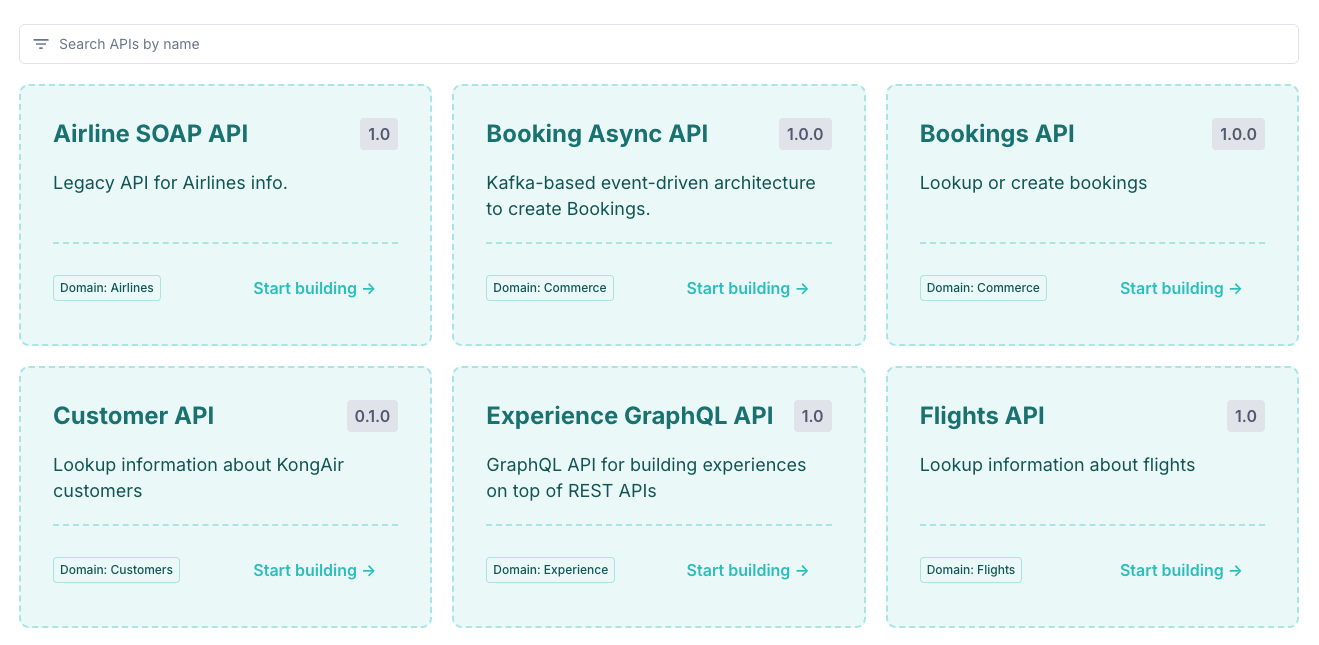
Use the Apis List component to display a list of published APIs within the Dev Portal.
The Apis List component displays a paginated collection of available APIs within the Dev Portal. This component helps developers quickly browse and discover APIs offered by the Dev Portal. It includes built-in filtering and pagination controls to support scalable API catalogs and improve navigation across large sets of APIs.
Users can search for APIs by name, and the component supports both pre-defined filtering for displaying only a subset of APIs on specific pages, as well as end user filtering in the UI.
v1
Lorem ipsum dolor sit amet, consectetur adipiscing elit. Nulla nec purus feugiat, molestie ipsum et, consequat nibh.
v1
Lorem ipsum dolor sit amet, consectetur adipiscing elit. Nulla nec purus feugiat, molestie ipsum et, consequat nibh.
v2
Lorem ipsum dolor sit amet, consectetur adipiscing elit. Nulla nec purus feugiat, molestie ipsum et, consequat nibh.
 ::apis-list
 ---
 cta-text: "View APIs"
 enable-search: true
 page-size: 3
 ---
 ::
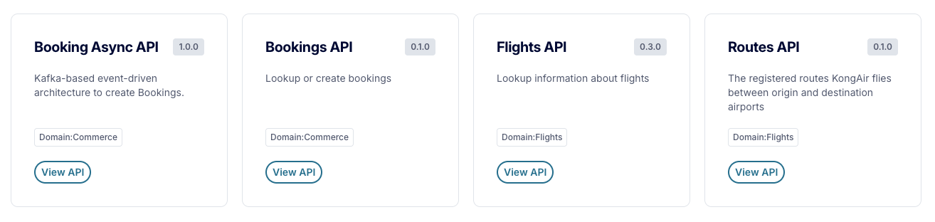
To display only certain number of APIs without pagination, use the example below:
v1
Lorem ipsum dolor sit amet, consectetur adipiscing elit. Nulla nec purus feugiat, molestie ipsum et, consequat nibh.
v1
Lorem ipsum dolor sit amet, consectetur adipiscing elit. Nulla nec purus feugiat, molestie ipsum et, consequat nibh.
v2
Lorem ipsum dolor sit amet, consectetur adipiscing elit. Nulla nec purus feugiat, molestie ipsum et, consequat nibh.
 ::apis-list
 ---
 cta-text: "Get started"
 page-size: 3
 pagination: false
 grid-columns-breakpoints:
  mobile: 3
  phablet: 3
  tablet: 3
  desktop: 3
 ---
 ::
The Apis List component supports both pre-defined filtering for displaying only a subset of APIs on specific pages, as well as end user filtering in the UI.
The component utilizes the assigned attributes to filter the list of APIs retrieved and displayed by the component.
Adding pre-defined filters on the Apis List component allows you to filter the APIs displayed based on specific attributes. This is useful for displaying only a subset of APIs on specific pages within your Dev Portal. The pre-defined filters are not editable by the end user and are not able to be cleared via the Filter UI.
To apply pre-defined filtering to the Apis List component, pass an object of attributes to the attributes prop. This will pre-filter the APIs displayed by the component by requesting only APIs that match the provided attributes from the Portal API.
For example, the following code will display only APIs that have the domain attribute set to Commerce or Flights.
::apis-list
---
attributes:
  domain:
    - "Commerce"
    - "Flights"
  # Alternatively, you may use inline array syntax
  # domain: ["Commerce", "Flights"]
card-attribute-keys: ["domain"]
---
::
You can additionally choose to display the attributes on the API cards by using the card-attribute-keys prop. This will display the specified attributes key/value pairs on each API card, allowing users to see the attributes of each API at a glance.
To display an interactive filter alongside the list of APIs, set the show-filter prop to true. This will display the filter in the Dev Portal's left sidebar below any existing page-layout snippets, allowing users to filter APIs by attribute(s).
By default, all assigned attributes key/value pairs will be displayed in the filter UI.
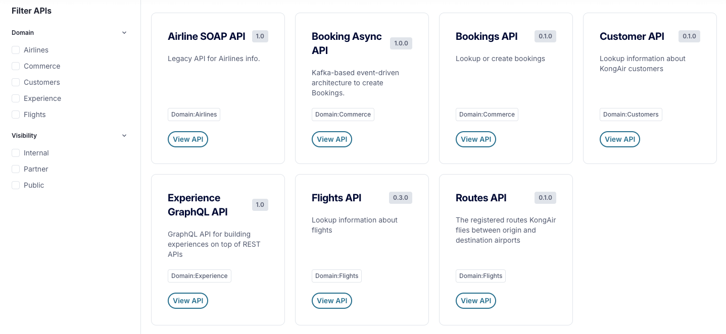
::apis-list
---
enable-search: true
show-filter: true
filter-attribute-keys: ["domain"]
card-attribute-keys: ["domain"]
---
::
You may define which attribute keys are available in the filtering UI by using the filter-attribute-keys prop.
If you also use a pre-defined filter (via the attributes prop), only the attribute values included in your pre-defined filter will be displayed under the corresponding attribute key in the filter UI.
The API attributes search is enabled by default when the filtering list contains more than 10 attributes. This behavior can be disabled by setting the enable-attributes-search prop to false.
Enables searching APIs by name. When the prop is set to true, the search input is displayed above the APIs list.
booleanfalseWhen the prop is set to true, the API filtering UI is displayed in the left sidebar below any existing sidebar snippets and allows users to manually filter the list of APIs.
When used alongside the attributes prop, the list will be pre-filtered to only include APIs that match the provided attributes.
booleanfalseOptionally provide a pre-defined object of API attributes to pre-filter the APIs displayed by the component.
Record<string, string[]>{}::apis-list
---
attributes:
domain:
- "Commerce"
- "Flights"
# Alternatively, you may use inline array syntax
# domain: ["Commerce", "Flights"]
---
::
An array of attribute keys to display on the API cards. If not provided, the component will not display any attributes on the API cards.
string[][]::apis-list
---
enable-search: true
show-filter: true
card-attribute-keys: ["domain"]
---
::
An array of attribute keys that determines what attributes are available in the filtering UI. Include the keys you would like developers to use to filter the list.
If not provided, the component will allow the developer to filter by all available attributes.
string[][]::apis-list
---
enable-search: true
show-filter: true
filter-attribute-keys: ["domain"]
---
::
Enables searching API attributes in the filtering list. When the prop is set to true and there are more than 10 attributes, the search input is displayed above the API attributes filters list.
booleantrueEnables pagination for the API List. When the prop is set to true, the pagination UI is displayed below the APIs List.
booleantrueThe current page number to display.
number1When enabled, the API list page number will be persisted in the page URL query parameter.
Typically only desired when displaying a large list of paginated APIs.
booleanfalseThe number of entities per page.
number24The pagination per-page options.
number[][24, 36, 48, 60]The call-to-action text to display on the API card's button.
stringView APIDefines the number of columns to display for specific viewport widths.
Providing a column number for a given breakpoint will allow larger breakpoints to inherit the value if the number of columns is not explicitly defined for the larger breakpoint.
Breakpoints{ mobile: 2, phablet: 3, tablet: 3, desktop: 4, } /** Number of columns once the viewport width is greater than or equal to the breakpoint shown below. */
interface Breakpoints {
/** 640px */
mobile?: number
/** 768px */
phablet?: number
/** 1024px */
tablet?: number
/** 1280px */
laptop?: number
/** 1536px */
desktop?: number
}
Rather than displaying the default UX of a list of API cards (one card per API), you can instead provide the name of a custom Snippet to render for each API. The component will render the specified Snippet for each API in the list, allowing for a fully customized UX for displaying APIs.
stringundefined::apis-list
---
card-snippet-name: "custom-api-item"
---
::
When looping through the APIs data, the component will automatically provide the API data to the Snippet, accessible via the snippet.api data properties. A special snippet.api.link property is also provided, which can be used to link to the API details page.
You can utilize the grid-columns-breakpoints prop to define the number of columns to display for each viewport width, allowing you to customize the layout of the API cards when using a custom Snippet.
When using a custom Snippet, you can also utilize the apis-attributes component to display the API's attributes badges in your Snippet. This component will automatically render the attributes assigned to the API, as defined by the card-attribute-keys prop, allowing you to easily display the API's metadata.
The apis-attributes component also accepts the following props:
backgroundColor - Defaults to 'var(--kui-color-background)'.border - Defaults to 'var(--kui-border-width-10) solid var(--kui-color-border)'.borderRadius - Defaults to 'var(--kui-border-radius-20)'.color - Defaults to 'var(--kui-color-text-neutral-strong)'.margin - Defaults to 'var(--kui-space-0) var(--kui-space-0) var(--kui-space-70)'.padding - Defaults to 'var(--kui-space-20) var(--kui-space-30)'.styles - Defaults to ''.snippet.api data properties where desired. We also use the apis-attributes component to display the attribute badges in the snippet.apis-list component within your Page document.::card
---
border-radius: "var(--kui-border-radius-50)"
background-color: "var(--kui-color-background-primary-weakest)"
border: "var(--kui-border-width-20) dashed var(--kui-color-border-primary-weaker)"
padding: "var(--kui-space-90)"
title-font-size: "24px"
title-line-height: "32px"
styles: |
box-shadow: none;
transform: scale(1);
transition: transform 0.2s ease-in-out, box-shadow 0.2s ease-in-out;
&:has(a:hover) {
transform: scale(1.005);
box-shadow: rgba(0, 0, 0, 0.15) 0px 2px 8px 0px;
}
.portal-card-description {
color: var(--kui-color-text-primary-strongest);
font-size: 18px;
line-height: 26px;
}
---
#title
::a
---
:href: snippet.api.link
margin: "0"
styles: |
color: var(--kui-color-text-primary-stronger);
&:hover {
color: var(--kui-color-text-primary-strongest);
}
---
{{ snippet.api.name }}
::
#actions
::badge
---
appearance: "neutral"
styles: |
font-size: 16px;
line-height: 24px;
---
{{ snippet.api.version }}
::
#default
{{ snippet.api.description }}
#footer
::container
---
display: "flex"
justify-content: "space-between"
styles: |
border-top: var(--kui-border-width-20) dashed var(--kui-color-border-primary-weaker);
padding-top: var(--kui-space-70);
---
:::apis-attributes
---
color: var(--kui-color-text-primary-strongest);
border: "var(--kui-border-width-10) solid var(--kui-color-border-primary-weaker)"
margin: "var(--kui-space-30) var(--kui-space-0)"
---
:::
:::button
---
:to: snippet.api.link
appearance: "tertiary"
size: "large"
display: "flex"
styles: |
align-self: flex-end;
---
Start building →
:::
::
::
This component also includes the shared props listed below:
fullWidth - default is false.styles - default is ''.See here for more information on shared props.
Use the actions slot to add custom actions for the ApisCard component's header.
Use the footer-left slot to overwrite the default button for the ApisCard component.