Components
Form Register
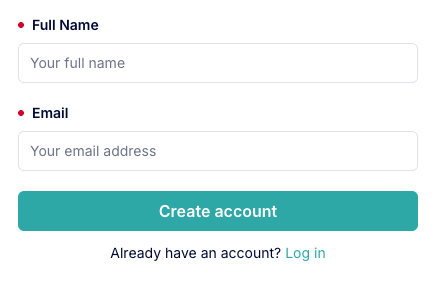
A registration form component that allows users to create or request a new developer account in the Dev Portal.
The Dev Portal comes with a built-in register page that allows users to create or request a new developer account. Internally, this page uses the form-register component, which can also be used in other pages or snippets while users are not already authenticated.
::form-register
---
cta-text: "Create account"
---
::
The standalone Form Register component can be utilized to create a completely custom register page layout or to integrate the registration form into existing page content.
Along with built-in submission and error handling logic, the component includes the following UI elements:
The component is automatically hidden in the following scenarios:
While you can choose to utilize the form-register component on any public page in your Dev Portal, the app enforces a path of /register for the built-in registration page.
To create a customized register page in your Dev Portal:
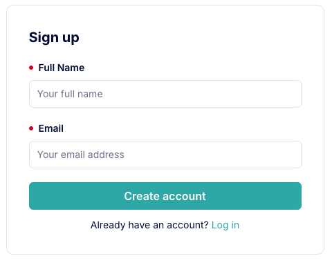
slug of /register. You must create the page with visibility set to 'public'. This will override the built-in registration page content.form-register component to the page's content to allow users to register for a new account.Here's a simple example of a custom register page that uses the form-register component:
---
title: "Sign up"
description: "Sign up for an account."
---

::container
---
vertical-align: "center"
height: "100%"
display: "flex"
flex-direction: "column"
align-items: "center"
justify-content: "center"
---
  :::card
  ---
  margin: "var(--kui-space-70, 20px) var(--kui-space-auto, auto)"
  max-width: "460px"
  ---
  #title
  Sign up

  #default
    ::::form-register
    ---
    cta-text: "Create account"
    ---
    ::::
  :::
::
Here's a more advanced example of a custom register page that uses the form-register component, along with additional MDC components and custom styles:

---
title: "Sign up"
description: "Sign up for an account."
---

::page-hero
---
full-width: true
full-height: true
title-font-size: "clamp(32px, 5vw, 48px)"
title-line-height: "clamp(36px, 5vw, 56px)"
title-font-weight: "600"
description-font-size: "clamp(16px, 5vw, 18px)"
description-line-height: "clamp(24px, 5vw, 28px)"
description-color: "var(--kui-color-text-neutral)"
vertical-align: "center"
image:
  src: "https://example.com/your-image.png"
  position: "right"
  border-radius: "15px"
  max-width: "60%"
styles: |
  .page-hero-textblock {
    padding: 40px !important;
    background: #F7F7F7;
    border-radius: 15px;
  }

  ul {
    color: var(--kui-color-text-neutral);
    list-style: none;
    font-size: 14px;
    line-height: 20px;
    margin: 20px 0 0 8px;
    padding: 0;
  }
---
#title
Sign up

#description
Sign up and get started building with our APIs today!

- 🔍  Explore API documentation and OpenAPI specs
- 🛠️  Register and manage your apps
- 🔐  Authenticate and start making requests

  ::form-register
  ---
  margin: "var(--kui-space-70) var(--kui-space-0) var(--kui-space-0)"
  ---
  ::
::
The form submit button text.
stringCreate accountThis component also includes the shared props listed below:
background - default is initial.backgroundColor - default is initial.border - default is initial.borderRadius - default is var(--kui-border-radius-0, 0).margin - default is var(--kui-space-0, 0).maxWidth - default is 400px.padding - default is var(--kui-space-0, 0).width - default is auto.styles - default is ''.