Components
Form Login
A login form component that allows users to authenticate into the Dev Portal via basic auth or SSO.
The Dev Portal comes with a built-in login page that allows users to authenticate via basic authentication or single sign-on (SSO). Internally, this page uses the form-login component which can additionally be used in a custom login page created in your Dev Portal to allow for customizing the layout and design of the login experience.
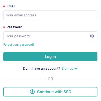
::form-login
---
basic-auth-cta-text: "Log in"
sso-auth-cta-text: "Continue with SSO"
---
::
The Form Login component will automatically enable or disable UI elements and functionality based on the authentication methods enabled in your Dev Portal settings.
Along with built-in authentication flow and error handling logic, the component includes the following UI elements:
Basic Authentication
Single Sign-On (SSO)
The component is automatically hidden in the following scenarios:
/loginTo create a customized login page in your Dev Portal:
slug of /login. You must create the page with visibility set to 'public'. This will override the built-in login page content.form-login component to the page's content to allow users to authenticate into your Portal.Here's a simple example of a custom login page that uses the form-login component:
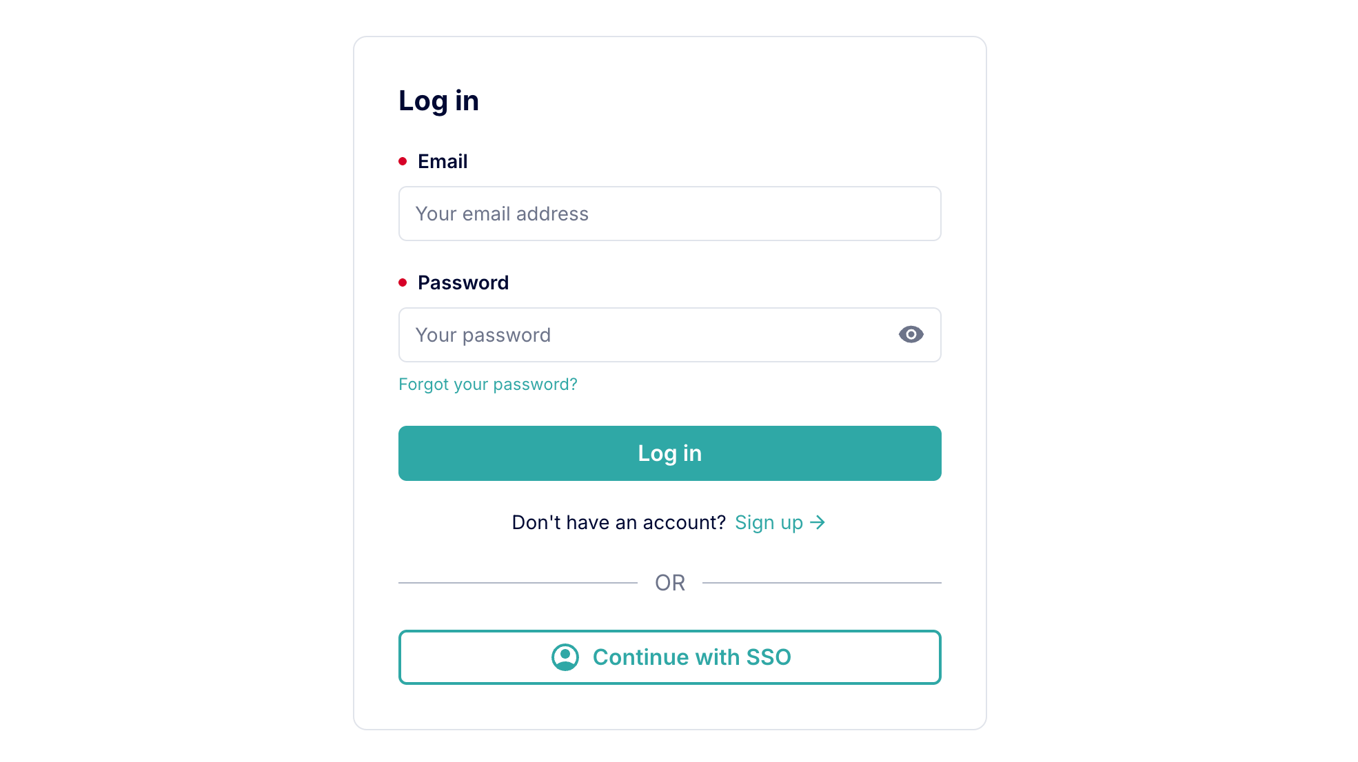
---
title: "Log in"
description: "Log in to our Developer Portal."
---

::container
---
vertical-align: "center"
height: "100%"
display: "flex"
flex-direction: "column"
align-items: "center"
justify-content: "center"
padding: "var(--kui-space-0, 0px) var(--kui-space-70, 20px)"
---
  :::card
  ---
  margin: "var(--kui-space-70, 20px) var(--kui-space-auto, auto)"
  max-width: "460px"
  ---
  #title
  Log in

  #default
    ::::form-login
    ---
    basic-auth-cta-text: "Log in"
    sso-auth-cta-text: "Continue with SSO"
    ---
    ::::

  :::
::
Here's a more advanced example of a custom login page that uses the form-login component, along with additional MDC components and custom styles:
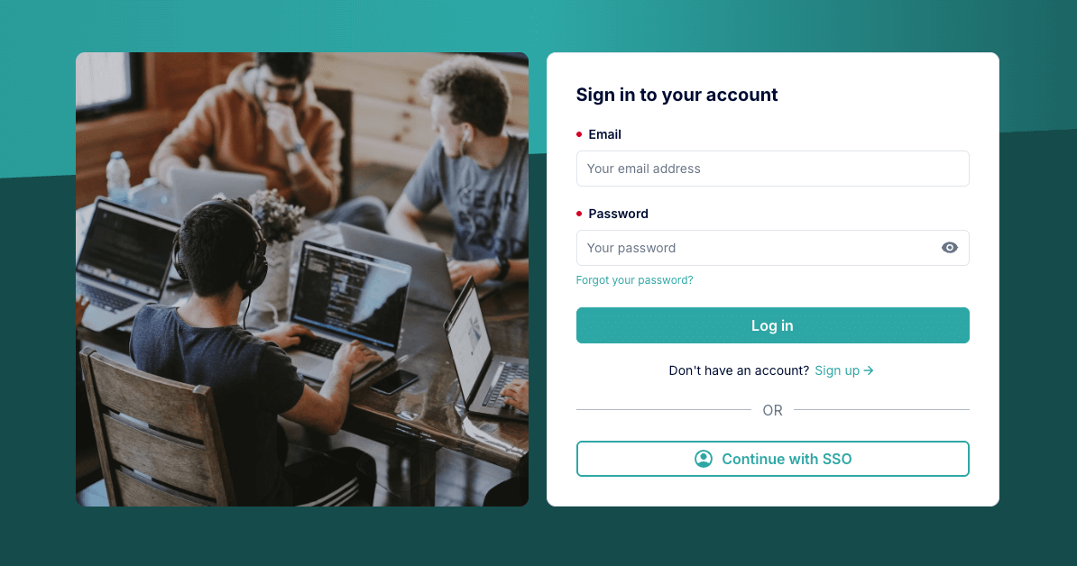
---
title: "Sign in to your account"
description: "Sign in to access your Dev Portal account."
---

::container
---
width: "100%"
height: "300px"
background: "linear-gradient(90deg, var(--kui-color-background-primary-strong) 0%, var(--kui-color-background-primary) 50%, var(--kui-color-background-primary-strongest) 100%)"
styles: |
  position: absolute;
  top: 0;
  clip-path: polygon(0 0, 100% 0, 100% 75%, 0 100%);
  -webkit-clip-path: polygon(0 0, 100% 0, 100% 75%, 0 100%);
  overflow: hidden;
---
::

::page-section
---
full-width: true
full-height: true
background-color: "var(--kui-color-background-primary-strongest)"
---
  :::page-section
  ---
  vertical-align: "center"
  height: "100%"
  display: "flex"
  flex-direction: "column"
  align-items: "center"
  justify-content: "center"
  padding: "var(--kui-space-0, 0px)"
  max-width: "var(--kui-breakpoint-tablet)"
  styles: |
    position: relative;
    z-index: 1;
  ---
    ::::multi-column
    ---
    vertical-align: "center"
    columns-breakpoints:
      desktop: 2
      laptop: 2
      tablet: 2
      phablet: 2
      mobile: 1
    ---
      :::::container
      ---
      background-image:
        url: "https://example.com/your-image.png"
        background-size: "cover"
      border-radius: "var(--kui-border-radius-50)"
      width: "100%"
      height: "100%"
      ---
      :::::

      :::::card
      #title
      Sign in to your account

      #default
        ::::::form-login
        ---
        basic-auth-cta-text: "Sign in"
        max-width: "none"
        ---
        ::::::
      :::::
    ::::
  :::
::
The basic authentication form submit button text.
stringLog inThe single sign-on (SSO) submit button text.
stringContinue with SSOThe single sign-on (SSO) instruction text displayed above the SSO button when only SSO is enabled and basic auth is disabled.
stringTo access the developer portal, please log in using the organization's single sign-on (SSO) provider.This component also includes the shared props listed below:
background - default is initial.backgroundColor - default is initial.border - default is initial.borderRadius - default is var(--kui-border-radius-0, 0).margin - default is var(--kui-space-0, 0).maxWidth - default is 400px.padding - default is var(--kui-space-0, 0).width - default is auto.styles - default is ''.